Graphic Signs / Logos (Selection)
Woźniak Furnitures

March 2023
Logo for a small familly buisness connected with furniture production. Elegant graphic mark is a overlayed two letters "W" and "M".
Lilienne
May 2021
Logo is a part of whole concept and strategy for new small (for now) company which is making baloon compositions. The concept is that baloons are new flowers - the alternative for cutting them and its short-term life after it. The baloons are made from ecological materials.
"Lilienne" is a french-sound word connected to lily flower.
Katarzyna Drausal

February 2020
This is a personal graphic sign for a teacher, Katarzyna Drausal. She teach at school and on-line. Logo is a combine of her initials "K.D.", "K" has a book inside and "D" has a wireless connection symbol. The key to this brand is that it's linked with Inspiracja Edukacja.
Olivka

September 2019
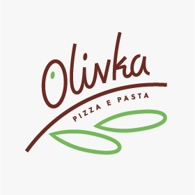
Olivka is a small restaurant in which you can eat Italian meals, mainly pizza and pasta. Logo is a redesign of a previous graphic sign which was to old for nowadays. Here's new custom lettering and composition. It looks like an olive twig with one olive fruit and two leaves. It's perfectly designed for social media avatars.
WWO Hip-Hop Fest
March-April 2019
Co-op with Piotr Gajewski
Full name of this music event is Wejherowo Hip-Hop Festival. Logo is a refference to Kashubian region colours and street culture which a part of it is hip-hop music. Typography is custom-made inspired by a rich history of the city. The graphic sign was designed in few composition versions such us vertical, horizontal and in rectangle.
Inspiracja Edukacja

November 2018
Inspiracja Edukacja (Inspiration Education) is a something between blog, videoblog and fanpage on Facebook. It is about education and for searching new methods of teaching and learning. Base of the logo is an "i" letter but without the dot above the stem. It's replaced by hand-drawn-look "e"
Grzegorz Samson (self-branding)

March-May 2017
That's my self-branding graphic sign. It's a monogram. Combined letters "g" and "S" makes some new kind of ligature. There is a huge contrast in letter stems because I am a one big contrast. Logo is also a mix of modern and classic styles.
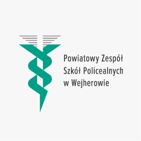
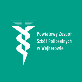
Medical School in Wejherowo

March 2016
This medical school is also known as "Medyk (it is hard to translate in English but it's a big shortcut of original school's name)". This redesign of previous logo presents a Rod of Asclepius with two snakes (it was originally with two snakes). You can see the negative space effect here. The wings are also designed in different, sophisticated way - as a horizontal stripes which transparency of them is decreased.
All rights reserved, no AI training allowed © Grzegorz Samson, 2026